








Built for clarity. Designed to recover.
Explore our brandExplore our brand
Logo
Download and use the CavBot mark, wordmark, and approved logo files.
View logo ColorsReview the main palette and the color roles that keep the system clear.
View colors Logo usageLearn spacing, scale, contrast, and practical rules for using the identity.
Use the logo Logo dont'sKeep the brand readable by avoiding treatments that weaken recognition.
View logo dont's TypographySee type scale, editable samples, and the approved font direction.
View typography Color paletteUse approved CavBot colors for signal, action, risk, and system clarity.
View palette Color usageApply color with discipline so the surface stays controlled and useful.
Use color Color dont'sSee examples that keep CavBot color disciplined, readable, and controlled.
View color dont's DimensionUnderstand how CavBot voice stays exact, useful, responsible, and direct.
View dimension BoilerplateCopy approved company descriptions for media, partners, and public references.
View boilerplate Let’s chatIf you’re a member of the media and would like to talk to someone at CavBot, please email us.
Email usBrand assets
Download logos,
marks, fonts,
and more
These reusable assets reflect the CavBot brand. For additional brand requests, Email us at [email protected].
Logos
The CavBot identity is built around a calm operating mark and a clear wordmark. Use these files when referencing CavBot in media, partner pages, product mentions, and approved company materials.
Full logo
Use the primary logo whenever possible. Alternate versions are available for light, dark, and single-color placements.

Brand mark
Use the mark for compact spaces, avatars, product badges, app icons, and trusted brand surfaces.

Wordmark
Use when the symbol is not needed and the CavBot name needs to stand on its own.

Colors
Our palette is built around depth, contrast, and control. Violet carries the brand, while black and white keep every surface clear, sharp, and recognizable.
Main palette
Lead with CavBot Violet. Use the supporting violet shades for depth, hierarchy, and interface states. Black and white remain the foundation for contrast, structure, and clarity.
 View all colors
Design
guidelines
Best practices for
logos, spacing, and
brand lockups
A simple system for keeping CavBot clear, consistent, and recognizable across every approved surface.
Logo usage
Use the full logo when space allows. Use the mark when the CavBot name is already clear or the placement is compact.
Sub-brands
Use sub-brand lockups only when they clarify a specific CavBot product, program, or surface. Keep the CavBot name first.
Intelligence
Cobranding
When CavBot appears with another mark, keep both logos balanced, separated, and clear. Do not merge the identities.

The dont's
Protect the identity. Do not stretch, recolor, rotate, crop, stack, add effects, or place the logo where contrast is reduced.
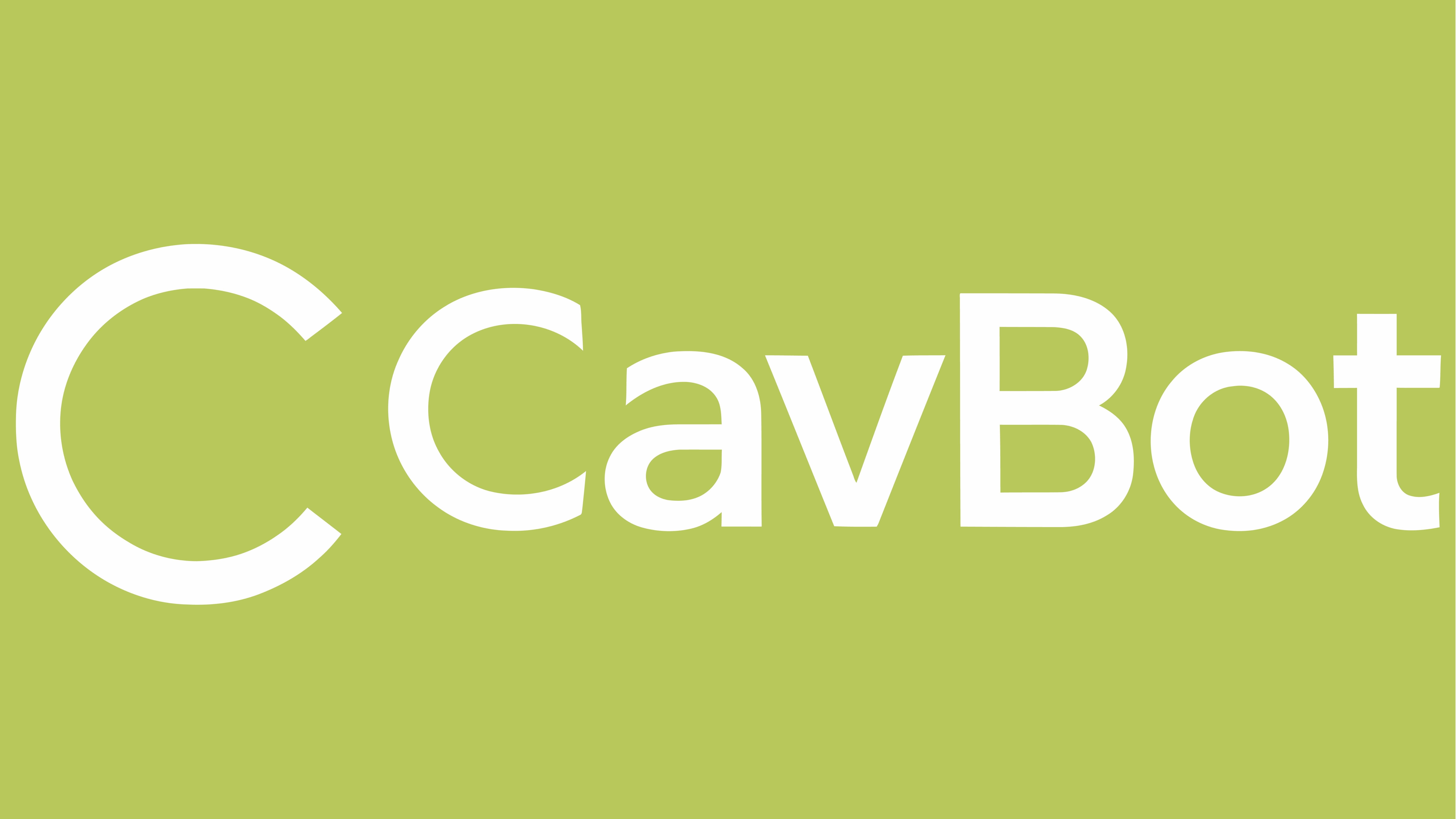
Don’t use the default logo on a color

Don’t fail contrast accessibility

Don’t alter, crop, skew, outline, or distort

Don’t rotate the logo

Don’t stack the logo vertically
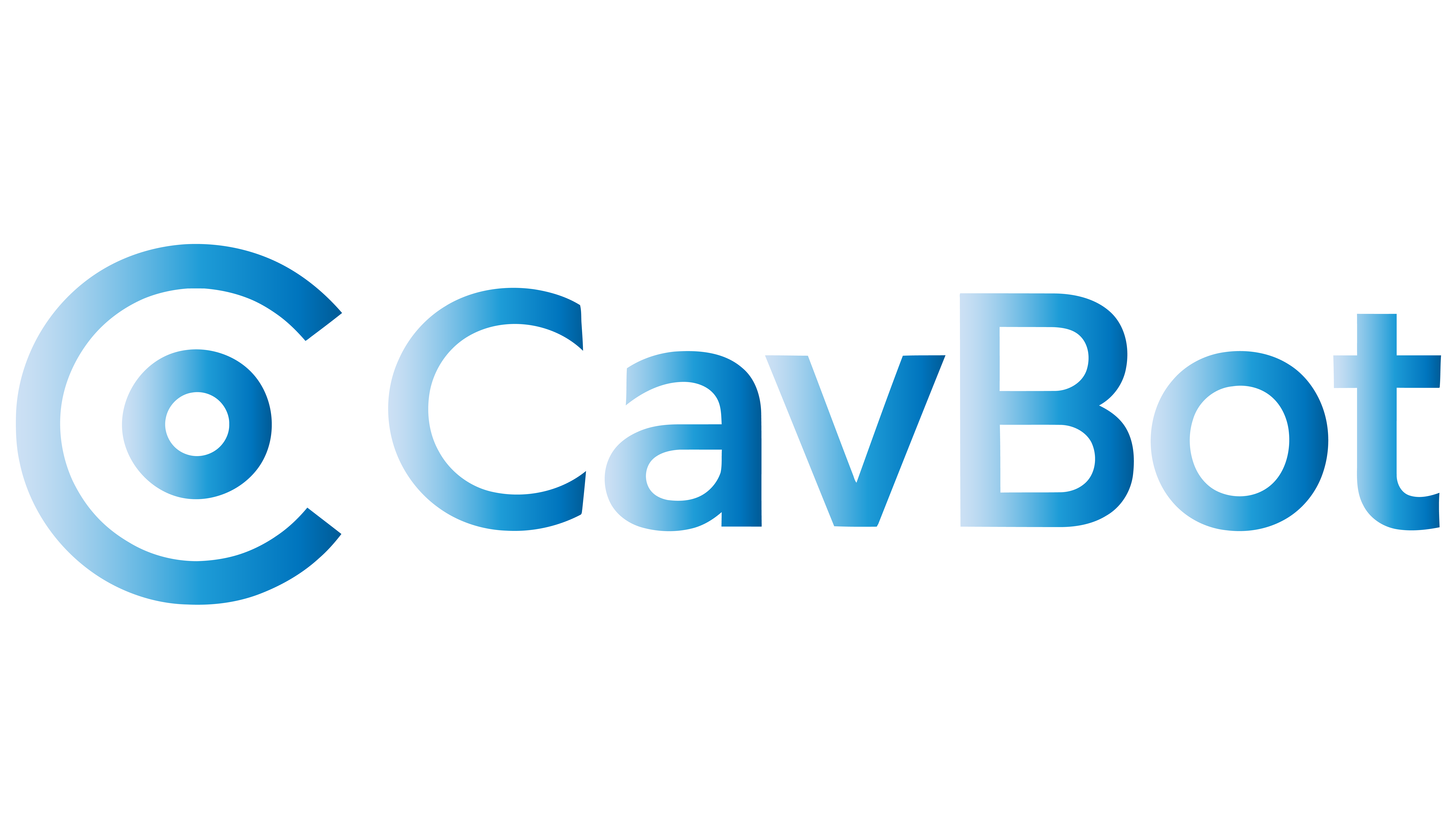
Don’t add gradients or effects
Our site is monitored by

Don’t substitute the logo in a sentence
Typography
Inter is the primary CavBot typeface. It keeps every brand surface clear, calm, and readable across product, web, dashboards, and technical communications.
AaBbCc123
AaBbCc123
AaBbCc123#
Headings & large texts
All CavBot headlines are set in Inter Semibold. Longer headlines can use regular weight while keeping emphasis clear and controlled.
Click on me to edit text
Google Font alternative: Poppins Semibold
Heading type stack
Put time and attention into the headlines, layouts, and hierarchy. Let the font do the rest.
Build efficiently
Know what happens after lauch
The command layer your website deserves
Real-time website intelligence
Know what broke before users leave
CavBot helps teams see broken routes, SEO gaps, and production signals from one operating view.
Observe. Understand. Act.
Paragraphs
Inter text styles are built for readability. Use sentence case, generous line height, and calm spacing so every CavBot message stays easy to understand.
Click on me and type anything you want so you can preview Inter in use.
Google Font alternative: Inter Regular
Paragraph type stack
Typeset text with optical kerning and use sentence case. Setting in all caps is allowed for eyebrows or short documentation labels.
CavBot gives teams one clear place to understand what is happening across their website — from broken routes and SEO structure to live production signals.
CavBot watches the routes, errors, structure, and signals that decide whether a site feels reliable or losing trust.
Turn 404s, metadata gaps, broken flows, and production issues into a clear operating view your team can act on.
CavBot helps developers, startups, and businesses see what their website is doing, where users get lost, and what needs attention next.
Keep product copy direct. Say what CavBot sees, why it matters, and what the team should do next.
Website intelligence
Observe. Understand. Act.
Color palette
CavBot color is built for dark product surfaces, clean contrast, readable states, and high-signal moments across dashboards, media, and support systems.
Core palette
The main operating colors used across CavBot product surfaces and brand layouts.
Secondary palette
Use these colors for system states, accents, alerts, charts, highlights, and supporting UI moments.
Soft states
Use soft states for chips, borders, empty states, selected rows, and low-pressure interface feedback.
Color usage
CavBot color should feel direct, technical, and unmistakable. Use the palette to separate signal, action, risk, and system clarity without turning the interface into decoration.

Route recovery in motion Signal layer
Live signals across every site Console view
The command layer for websites Brand system
Spot issues before they spread Alert state
Broken routes need clear priority Error state
Structure every signal with intent Core surface
Keep dashboards readable at speed Support state
Turn insight into the next action Action state
The don'ts
Use CavBot color with discipline. Each example should stay readable, controlled, and easy to recognize without overloading the surface.
Don’t use multiple colors in a single illustration
Not ready for publish
Don’t use color as the main text treatment
Don’t use multiple colors in a contiguous line
Don’t create gradients
Don’t pair floods of color

Don’t recolor the mark outside approved logo files
Voice and tone
Language for
product, support,
media, and trust
CavBot speaks like a serious operating intelligence layer for websites:
exact about what happened,
clear about why it matters, and practical about what comes next.
Exact
Useful
Responsible
Direct
Dimensions of voice
CavBot’s voice is built for moments where reliability, trust, and speed matter. Every sentence should reduce uncertainty and move the user closer to a decision.
Exact
Name the route, state, metric, or behavior. Use specific words instead of broad warnings. When the product knows the source, say it. When it does not, say that too.
Corresponding brand principle: Precision over noise
Do
Say what happened, where it happened, and what changed.
Use numbers when they make the decision clearer.
Don’t
Hide the issue behind vague alerts.
Make every state sound urgent when the data does not support it.
In use
“Checkout returned 404s on mobile paths after the latest deploy. Review route handling before the next traffic push.”
Useful
CavBot copy should give the user something they can act on. The best message does not only report a problem; it helps understand the next move.
Corresponding brand principle: Insight earns action
Do
Lead with the step the team can take next.
Separate urgent work from background checks.
Don’t
Report issues without direction.
Fill product surfaces with commentary when a clear next step is better.
In use
“Meta titles are missing on 12 indexed pages. Start with the pricing and docs routes.”
Responsible
CavBot stays credible by being precise about certainty. Confirm what is known, separate it from what still needs review, and never let the product sound more certain than the data allows
Corresponding brand principle: Evidence before certainty
Do
State what CavBot can confirm.
Show when more review is needed.
Don’t
Guess the cause without evidence.
Present partial information as a final answer.
In use
“CavBot detected a spike in failed requests. The source is not confirmed yet; API and auth routes should be reviewed first.”
Direct
Use plain, professional language. Put the main point first. In product surfaces, a short instruction usually beats a clever line.
Corresponding brand principle: Fewer words, more signal
Do
Put the main point first.
Keep labels short, readable, and easy to scan.
Don’t
Use clever copy for serious states.
Make users decode what the message means.
In use
“Robots.txt changed. Search access may be affected.”
A quick note on voice vs. tone
CavBot’s voice stays the same. It is exact, useful, responsible, and direct.
Tone changes by context. In the console, use compact labels. In support, add more explanation. In media, lead with the problem CavBot solves. In incident states, be specific, measured, and helpful.
For approved company descriptions, product summaries, and press language, continue to boilerplate.
Boilerplate
Use these approved descriptions when someone asks what CavBot is. Keep the language factual, direct, and consistent across media, partner pages, product surfaces, and public references.
In a sentence
CavBot is a website intelligence platform that helps businesses find and understand
website problems.
In a few sentences
CavBot is a website intelligence platform that helps businesses understand what’s happening across their websites.
We bring clarity to what happens after launch — helping every digital experience stay reliable, resilient, and ready to recover.
Product summary
CavBot gives teams one clear place to understand website health after launch. It watches the signals that affect trust, recovery, SEO structure, and user experience so teams can respond with context instead of guesswork.
Built for founders, operators, and digital teams, CavBot turns post-launch website intelligence into practical direction: what happened, why it matters, and what should happen next.
Let’s chat
If you’re a member of the media and would like to talk to someone at CavBot, please email us.